

WATERCOLOR PAINTING
I love watercolor. Although I am in awe of the more refined approach used by botanical illustrators and the English school, I'm drawn to a looser more impressionistic style. It is the simple, abstract and somewhat unpredictable nature of this medium that attracts me.
There is a certain lack of control combined with a spontaneity that excites me. Like pen & ink, once you lay it down - that's pretty much it. Messing with it too much seems to stiffen the passage. So for me, it begs for a gestural approach that gets laid down with verve and confidence. When it's done well, it looks so effortless and organic.
I started playing around with watercolor when I wanted to teach myself more about color and color theory. I wanted to learn more about the relationship of colors and the importance of establishing and implementing an appropriate palette.
I'd highly recommend Nita Leland's book, Exploring Color. It was very instrumental in getting me started down the road toward a greater understanding and deeper appreciation of how I used color. It was also a great introduction to painting with watercolors.
If you want some inspiration: Winslow Homer, John Singer Sargent and Egon Schiele are a good place to start. I feel like it will take a lifetime of practice to achieve any kind of mastery over this liquidy medium. But the chase is really all the fun, n'est pas?
PAINTING WITH GOUACHE
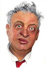
My first serious attempts at painting were with gouache. (see images above) One of the very first things I ever painted was the image of Rodney Dangerfield. My reference was a Rolling Stone magazine cover. I wish I still had that issue to show for comparison, I think the likeness is quite good.
Gouache is really just an opaque version of watercolor. It has a higher ratio of pigment to water and larger particles, so it covers more. It was commonly used by illustrators in commercial work for posters and for animation cels, but was also used by fine artists like J.M.W. Turner for 'En plein air' studies. Syd Mead uses it for his conceptual paintings.
It is a little tricky to work with because the color shifts value a bit as it dries. Generally lighter colors get darker and darker colors get lighter. So you need to learn to compensate a bit.
I often use watercolor and gouache together, generally starting out with watercolor to block out the basic painting, and then coming in with gouache to tighten up areas where I want higher detail, and you can definitely get some crisp detail with gouache.
I think It is also great for 'en plein air' work; it dries quickly and you can paint over a section for quick edits. This also seems to make it a easier 'sketching' medium than watercolor for me.
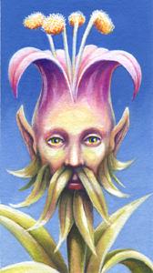
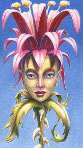
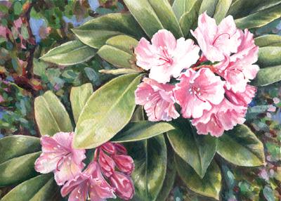


images clockwise from top left:
-rhododendron (gouache on paper)
-the Mayflowers (gouache on paper)
-Rodney (gouache on board)
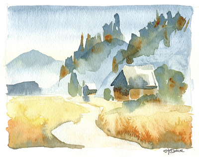
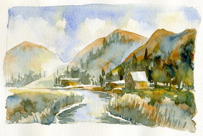
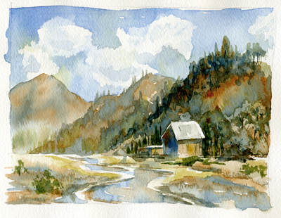
-Farm House series (watercolor on paper)